How to create full screen background video with cover image
So, you want a beautiful full screen background HTML5 video on your site, don’t you?
Let’s look at the demo first: mdavid626.com.
First of all, you will need a fancy video clip. If you already have one, great! If not, then don’t worry you can find plenty of them for free on this site:
coverr.co: beautiful, free videos for your homepage
All right, so you picked one? Absolutely amazing, let’s go on.
Today most modern browses support native HTML5 video. Just go to caniuse.com to check it out:
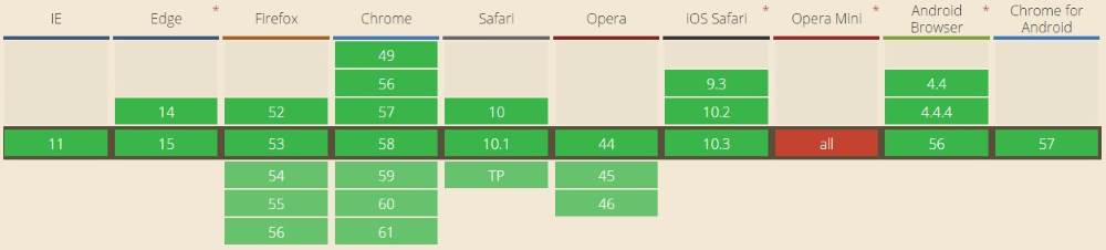
Basically, every browser supports it. Even Internet Explorer. Great!
Not so fast… On mobile, most of the browsers just won’t play silent background video without user interaction. The user has to initiate the play manually. This means our video just won’t work. The browsers won’t even download the first frame of the video. This means, you will see basically nothing.
Therefore, we will use a little workaround here. We’ll place a static cover image as a background for the video. If the browser doesn’t understand the video tag or just chooses not to play or download it, then the user will see the cover image. Which is of course not the so fancy as the video, but it’s good enough.
To add the video just use this simple markup:
<div class="video-cover">
<video class="video" muted loop autoplay preload="auto">
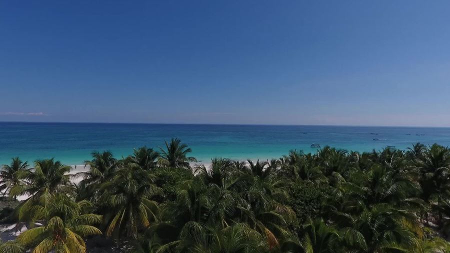
<source src="Palm_Trees.mp4" type="video/mp4">
</video>
</divOf course, you can add additional source elements, supporting more media types, like OGG or WEBM. Add every format you have. Make sure you configured the proper MIME types on your web server. See this page for more details.
We’ll position and style the cover image purely with CSS. No Javascript or jQuery required.
Start with this little CSS for providing better cross-browser consistency in the default styling of HTML elements:
html,
body,
div,
video {
    margin: 0;
    padding: 0;
}

html,
body {
    height: 100%;
}
If you use a library like Bootstrap, then you probably have something similar there already, so you can ignore it.
Positioning of the video element is really simple:
.video {
    position: fixed;
    top: 50%;
    left: 50%;
    z-index: -100;
    min-width: 100%;
    min-height: 100%;
    transform: translate(-50%, -50%);
}
Ideally, you would want to use the background-image CSS property to position the video. Unfortunately, you cannot use it for a video element, because it is not (yet?) supported. So, we have to use a little trick here. We move the (0,0) point from the top left corner to the center of the screen. Then, with a simple CSS3 transform, position it back to the top left corner. The result is a properly stretched full screen video.
One very important thing is to set the proper size of the video. You might use the auto value:
Width: auto;
Height: auto;
Which at first seems to be working just fine. But the stretching will not work entirely properly. Just look at this video:
You will see the background cover image and then the first frame of the video. Do you see the problem? They are not positioned and stretched exactly the same. I think it is because of the aspect ratio of the video. So, we’ll have to consider the aspect ratio of the browser window to set width and height of the video.
My video’s aspect ratio is 16:9 so I’ll use this code:
@media (min-aspect-ratio: 16/9) {
    .video {
        width: 100%;
        height: auto;
    }
}

@media (max-aspect-ratio: 16/9) {
    .video {
        width: auto;
        height: 100%;
    }
}
To style the cover image use this markup:
.video-cover {
    position: fixed;
    z-index: -200;
    min-width: 100%;
    min-height: 100%;
    width: 100%;
    height: 100%;
    background-image: url(cover.jpg);
    background-position: center;
    background-repeat: no-repeat;
    background-size: cover;
}
Nothing fancy here, it’s really simple. Basically, it’s using the background-image CSS property with the clever cover background-size value. The image will be stretched properly.
To place the video above the image we’ll place the video element as the child of the cover div. If the video starts playing the cover image won’t be visible. If not, the cover will be visible. So really simple, no Javascript required.
So, the final code looks like this:
<!DOCTYPE html>
<html lang="en">
<head>
    <meta name="viewport" content="width=device-width, initial-scale=1" />
    <style>
        html,
        body,
        div,
        video {
            margin: 0;
            padding: 0;
        }

        html,
        body {
            height: 100%;
        }

        .video {
            position: fixed;
            top: 50%;
            left: 50%;
            z-index: -100;
            min-width: 100%;
            min-height: 100%;
            transform: translate(-50%, -50%);
        }

        .video-cover {
            position: fixed;
            z-index: -200;
            min-width: 100%;
            min-height: 100%;
            width: 100%;
            height: 100%;
            background-image: url(cover.jpg);
            background-position: center;
            background-repeat: no-repeat;
            background-size: cover;
        }

        @media (min-aspect-ratio: 16/9) {
            .video {
                width: 100%;
                height: auto;
            }
        }

        @media (max-aspect-ratio: 16/9) {
            .video {
                width: auto;
                height: 100%;
            }
        }
    </style>
</head>
<body>
    <div class="video-cover">
        <video class="video" muted loop autoplay preload="auto">
            <source src="Palm_Trees.mp4" type="video/mp4">
        </video>
    </div>
</body>
</html>
Feel free to comment if you have any question or just need a little help.
Comments